NativeBase meets Figma
The NativeBase team introduced the "NativeBase Design Kit" as a highly requested addition to the ecosystem. This Figma integration combines design and development capabilities, offering component variants aligned with the NativeBase Library.
The design kit enables seamless translation from Figma designs to code projects using NativeBase utility classes. As the team notes, consistency is maintained across all elements: "Typography, spacing, colors, or other components, everything follows the NativeBase standard."
This post was authored by Tanisha Biswas and Probin Johori, Product Designers.
Something for Everyone
Designers
Designers can leverage this UI kit to create versatile designs built on the NativeBase foundation, with the flexibility to customize according to specific branding guidelines.
Product Managers
The Figma file bridges the designer-developer gap, ensuring smooth transitions between design and development phases while allowing product managers to focus on business logic.
Developers
Developers benefit from visual design representations that reduce surprises during UI implementation, with access to extensive component variants and existing design tokens.
Foundation - Style Guide
Every component in the Figma file is built around the NativeBase Design System foundation, including colors, typography, and additional design elements that ensure consistency across projects.
Auto Layout
The design system leverages auto layout functionality, allowing components to resize without distorting spacing and positioning. This eliminates the need to design each component multiple times across different platforms. Components automatically maintain consistent spacing regardless of size adjustments.
Components and Variants
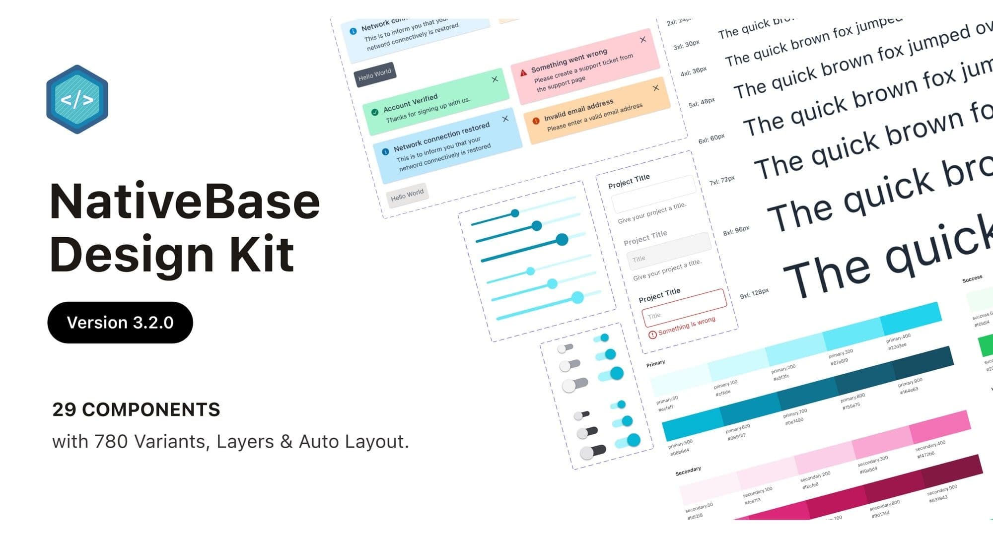
The Figma file includes 29 components with over 780 variants, encompassing all NativeBase library variations. For example, the alert component features four themes with six styles each, providing designers multiple options for any use case.
Responsive Designs
Components are designed to be responsive across all screen sizes. The system accommodates multiple platforms and allows easy adjustment to different sizes and custom viewports without compromising functionality or appearance.
Dark and Light Theme
Both light and dark theme variants are available, designed with accessibility considerations. While light themes remain traditional, dark themes improve accessibility and align with current design trends.
What's Next
The team announced upcoming v4 versions addressing component states, color contrast, and accessibility improvements. The community is encouraged to join the Discord channel for updates on the latest developments.